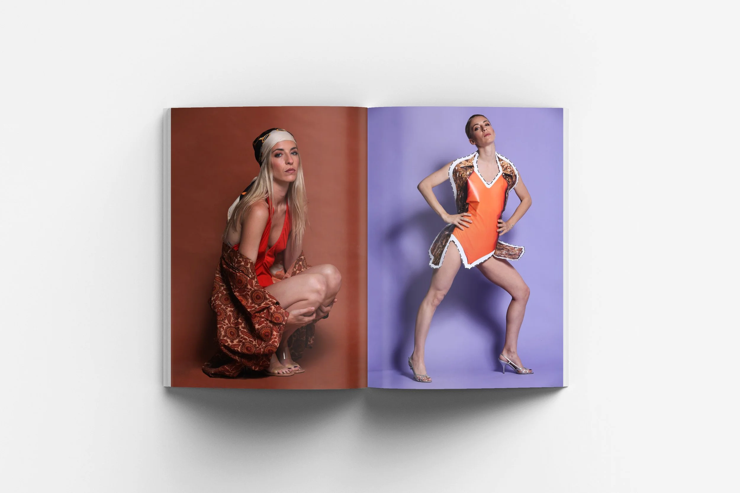
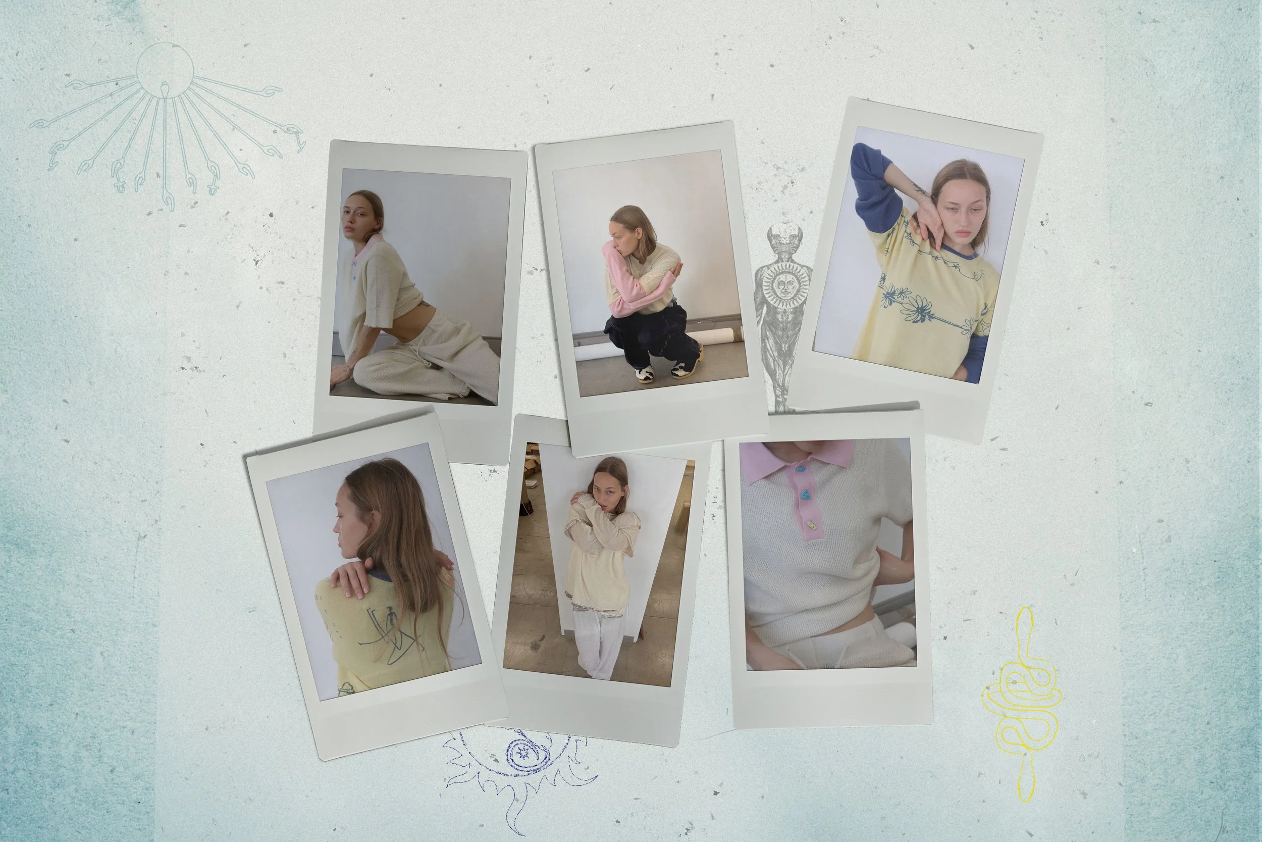
Newsletter design and brand assets for Adrian Cashmere. Clothes and drawings by Adrian Cashmere. Generated with Photoshop, Midjourney and Krea AI.

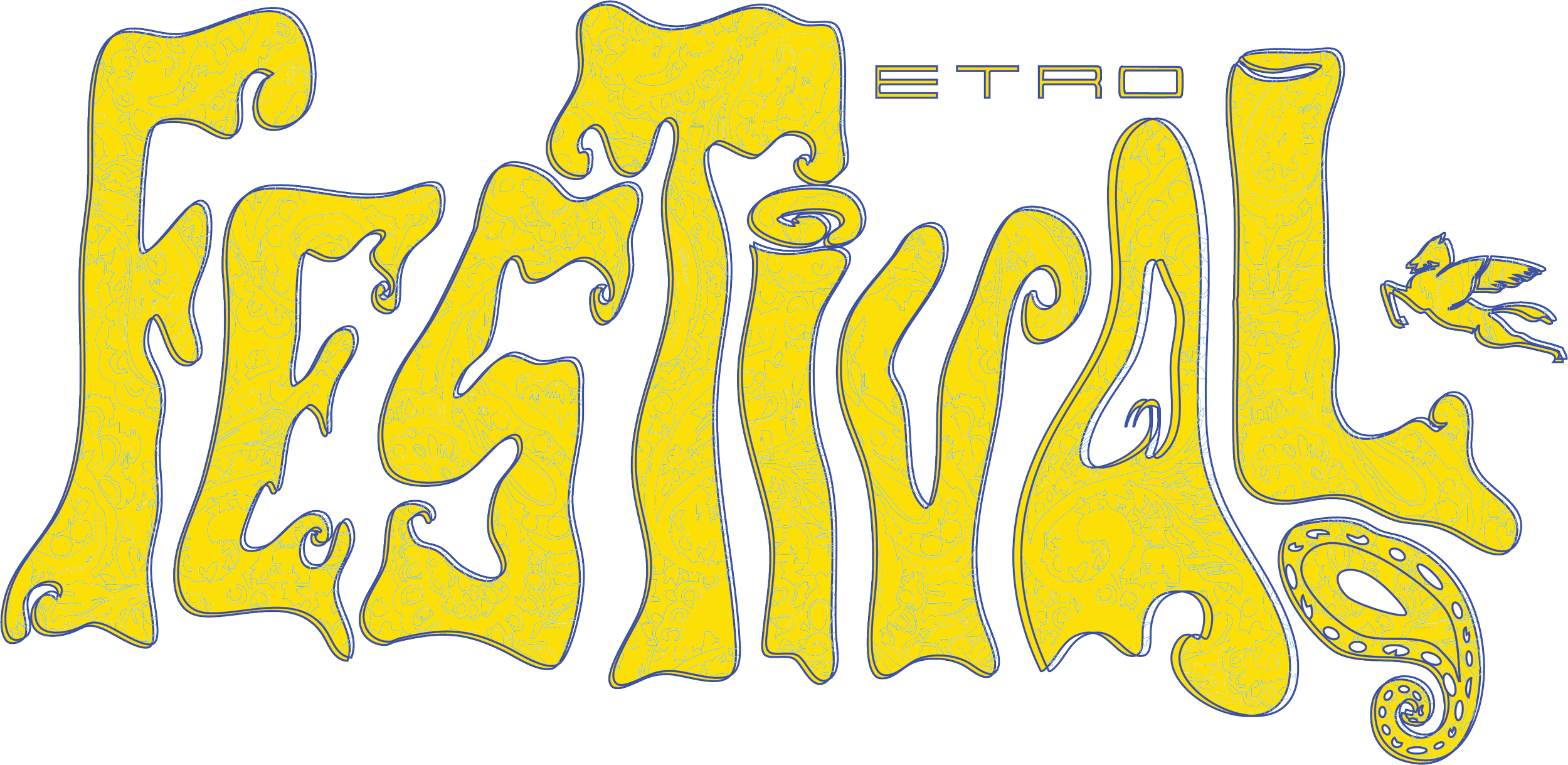
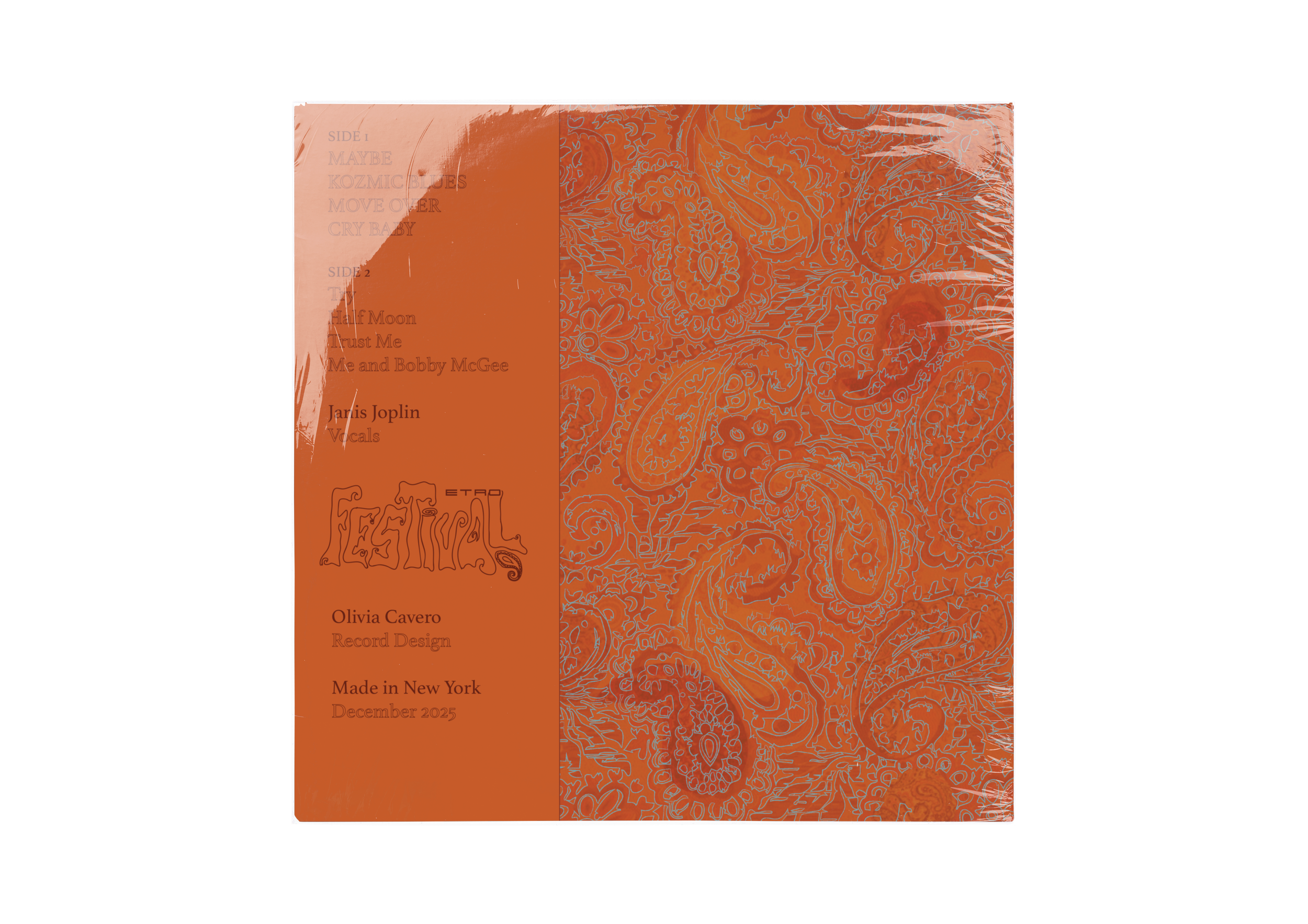
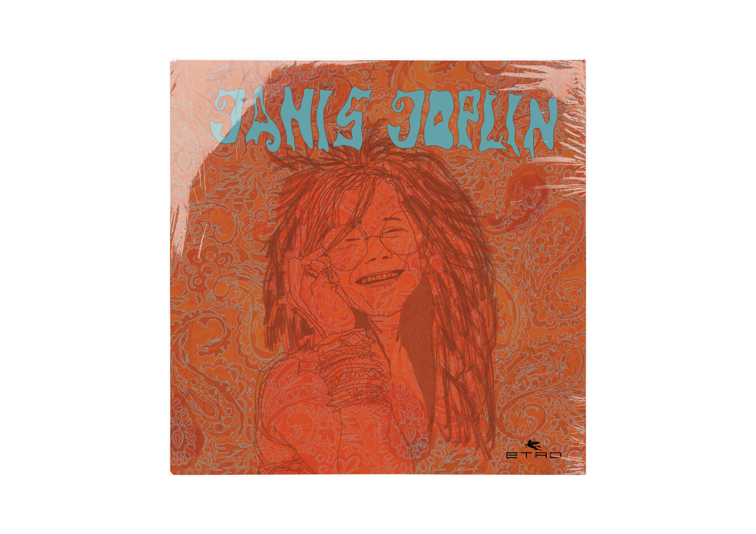
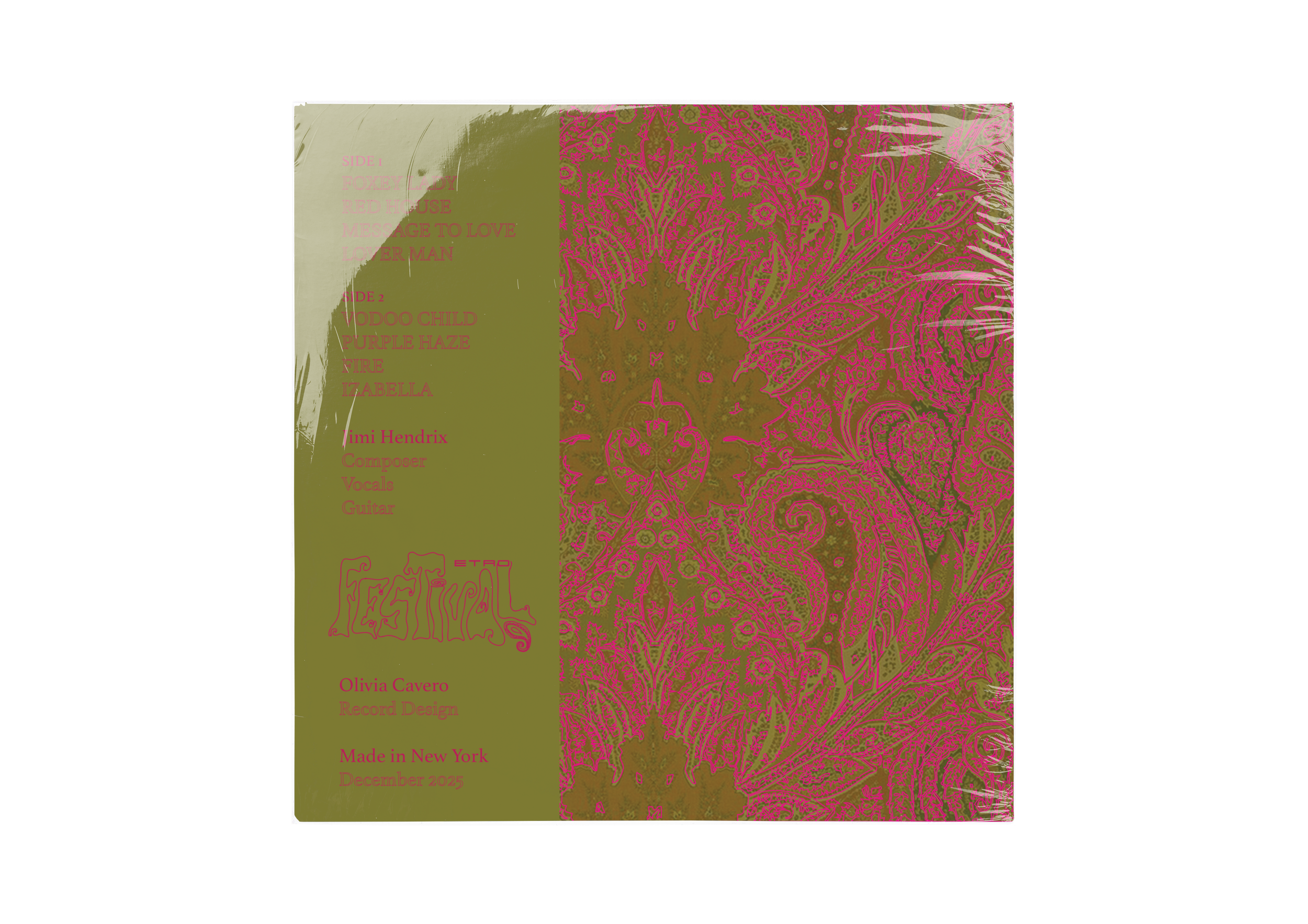
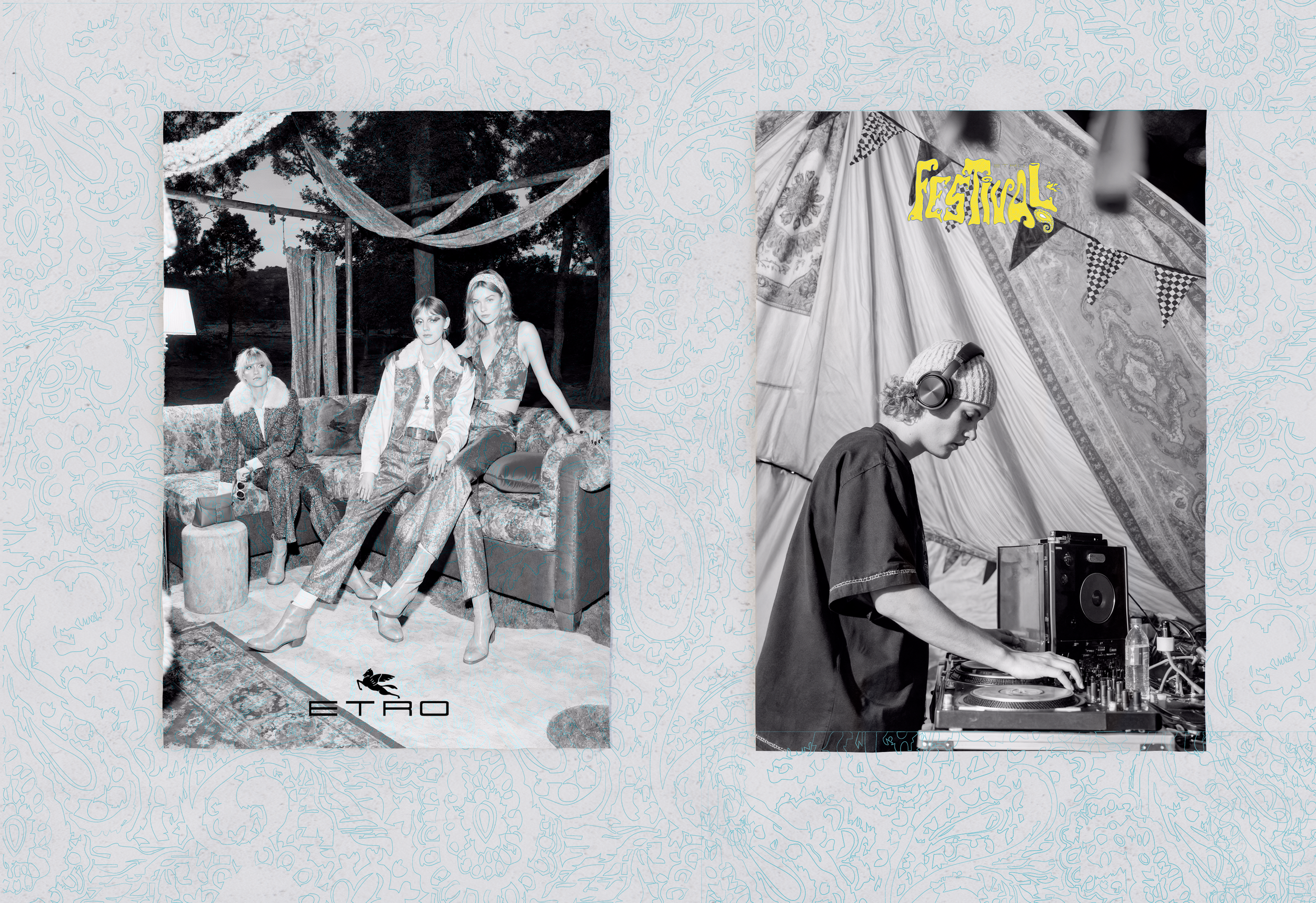
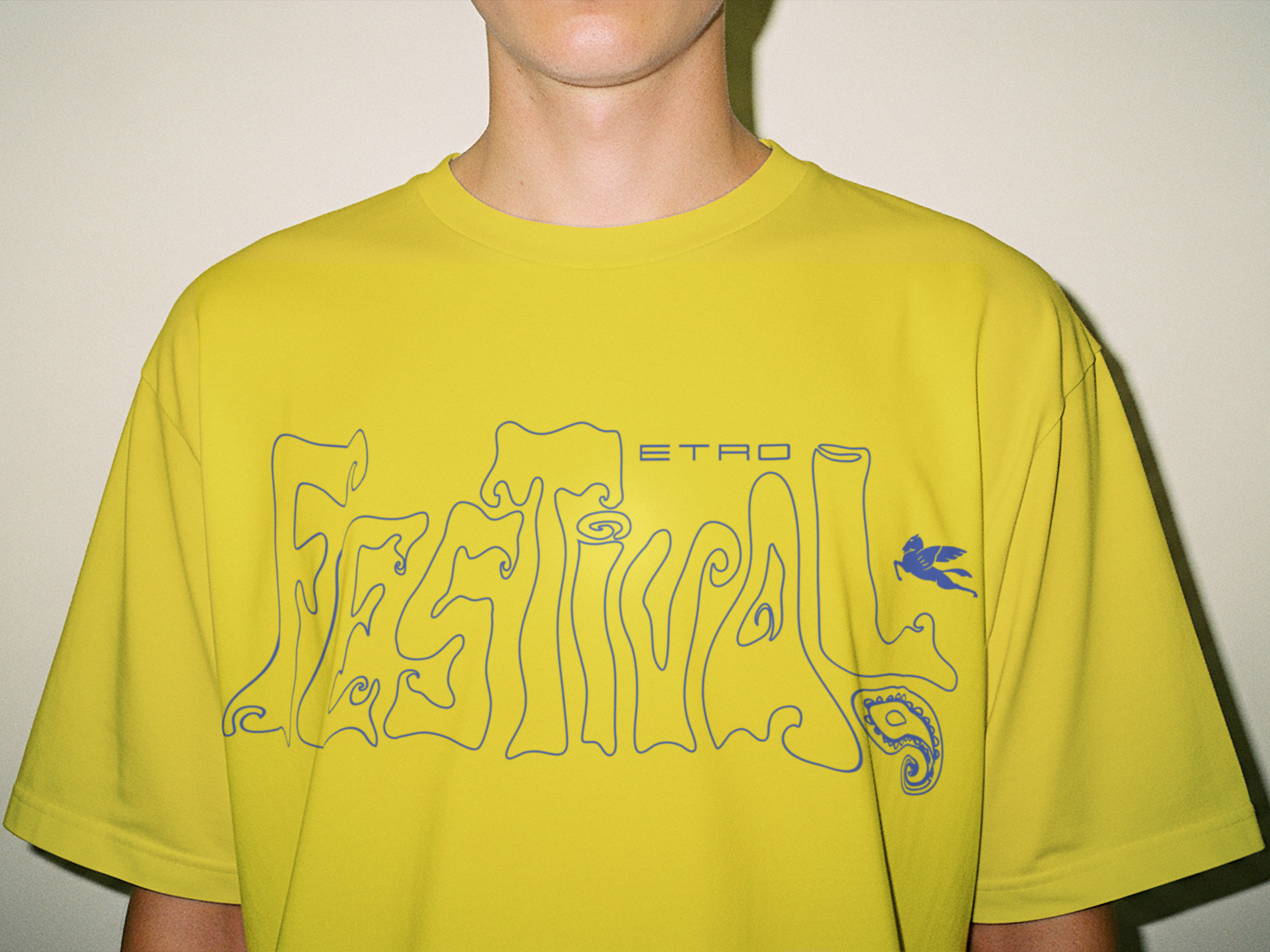
Etro was founded in 1968 — the same cultural moment that produced Woodstock. This project builds on that native identity, proposing the Etro Music Festival as a live brand experience designed to reconnect with younger audiences. The visual world spans a campaign poster, festival logo, artist illustrations, custom paisley patterns, and 1970s-inspired record sleeves.
Click here to see full process
Etro Festival. Core 3 - Parsons School of Design


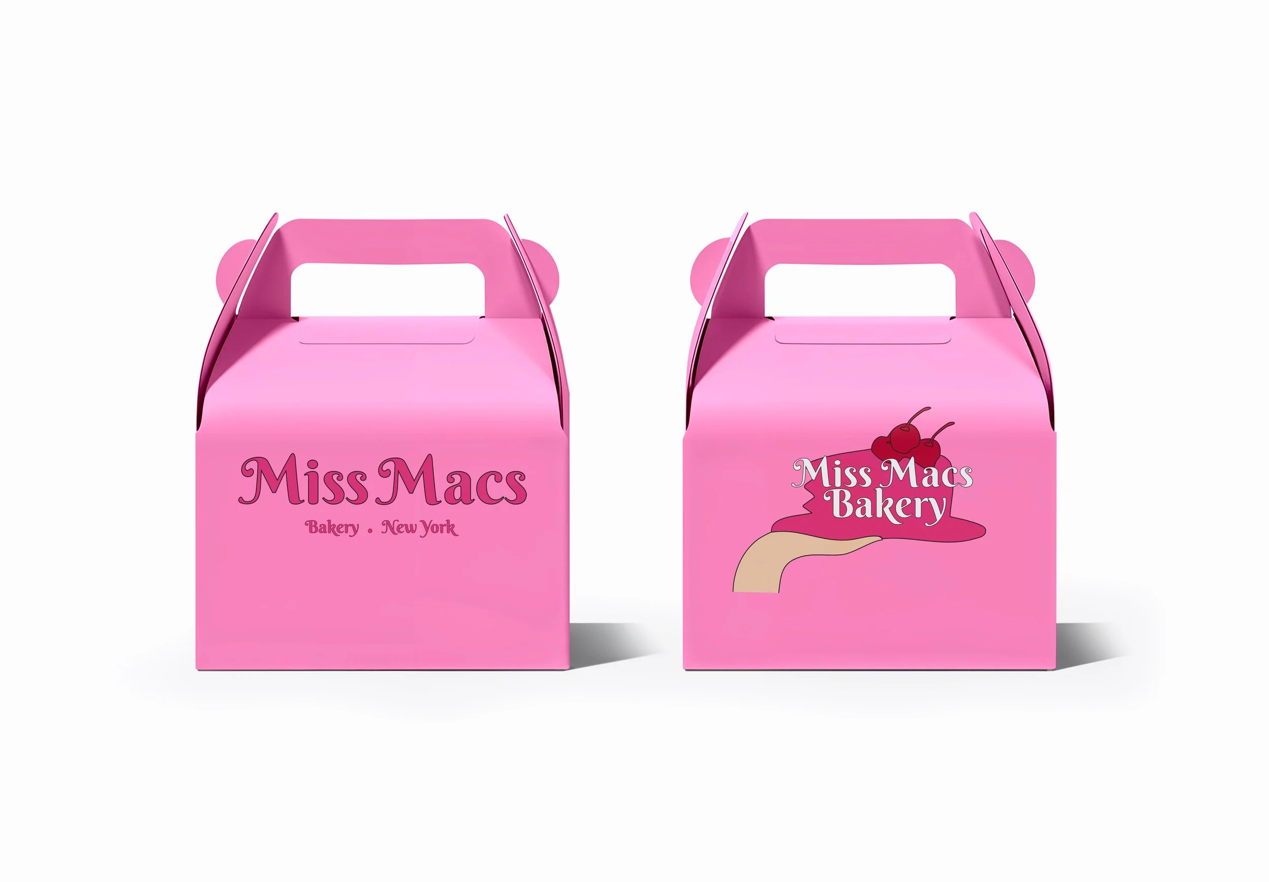
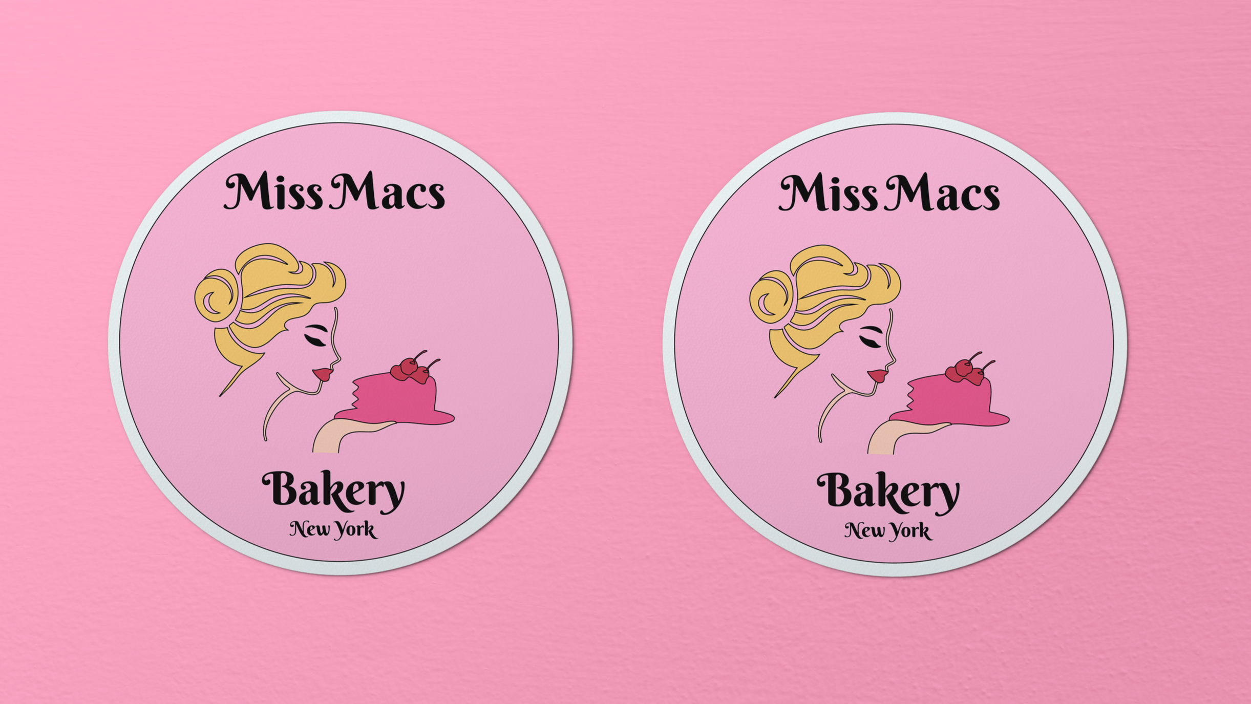
Logo rebrand concept for Miss Macs Bakery. Typographic elements feature a custom-altered typeface refined in Illustrator; illustrative elements were generated in Midjourney and further developed in Illustrator, with original sketches informing the overall direction.
Click here to see full process


Poster Design Project
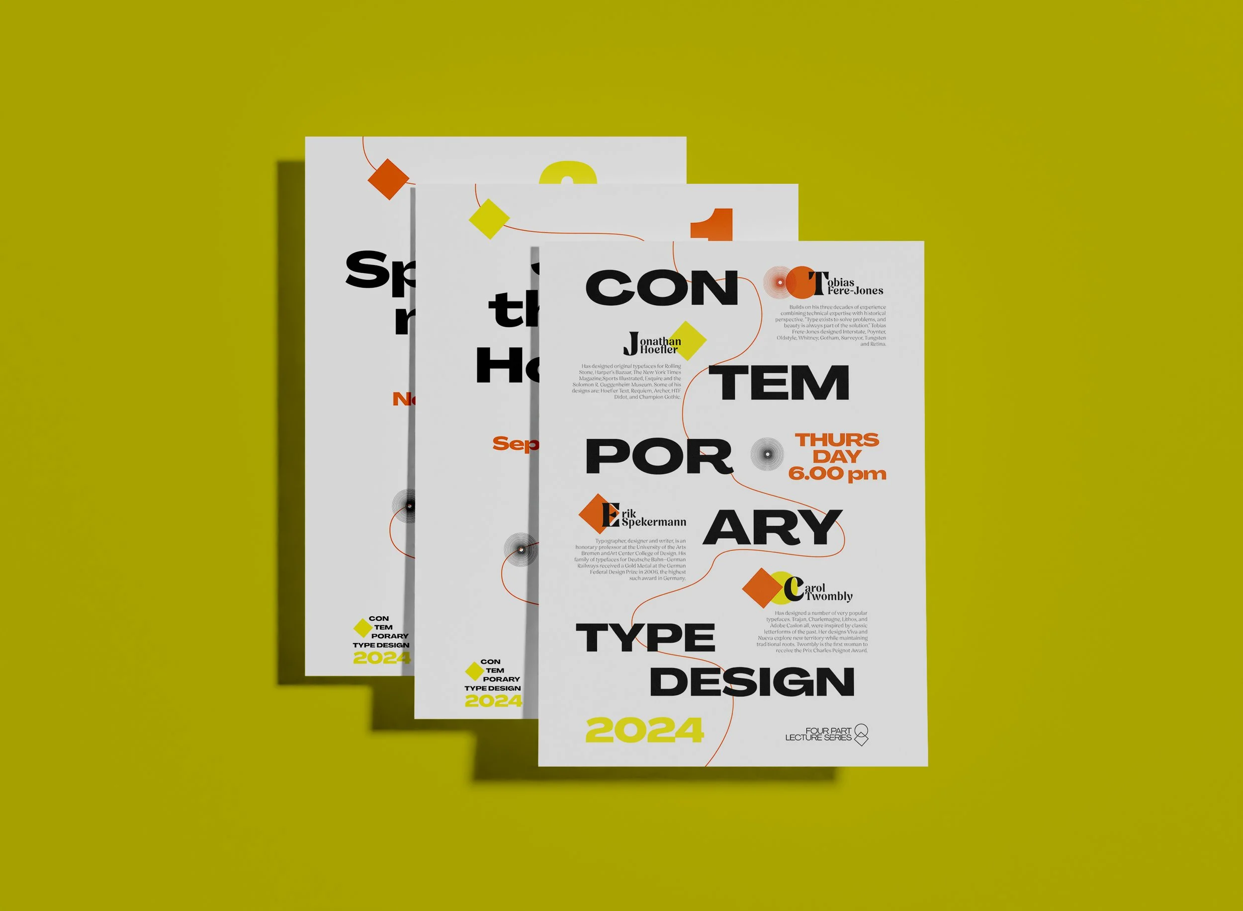
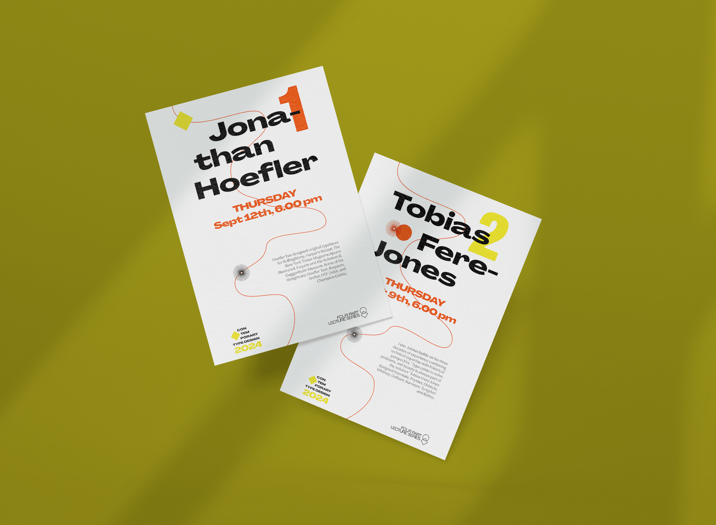
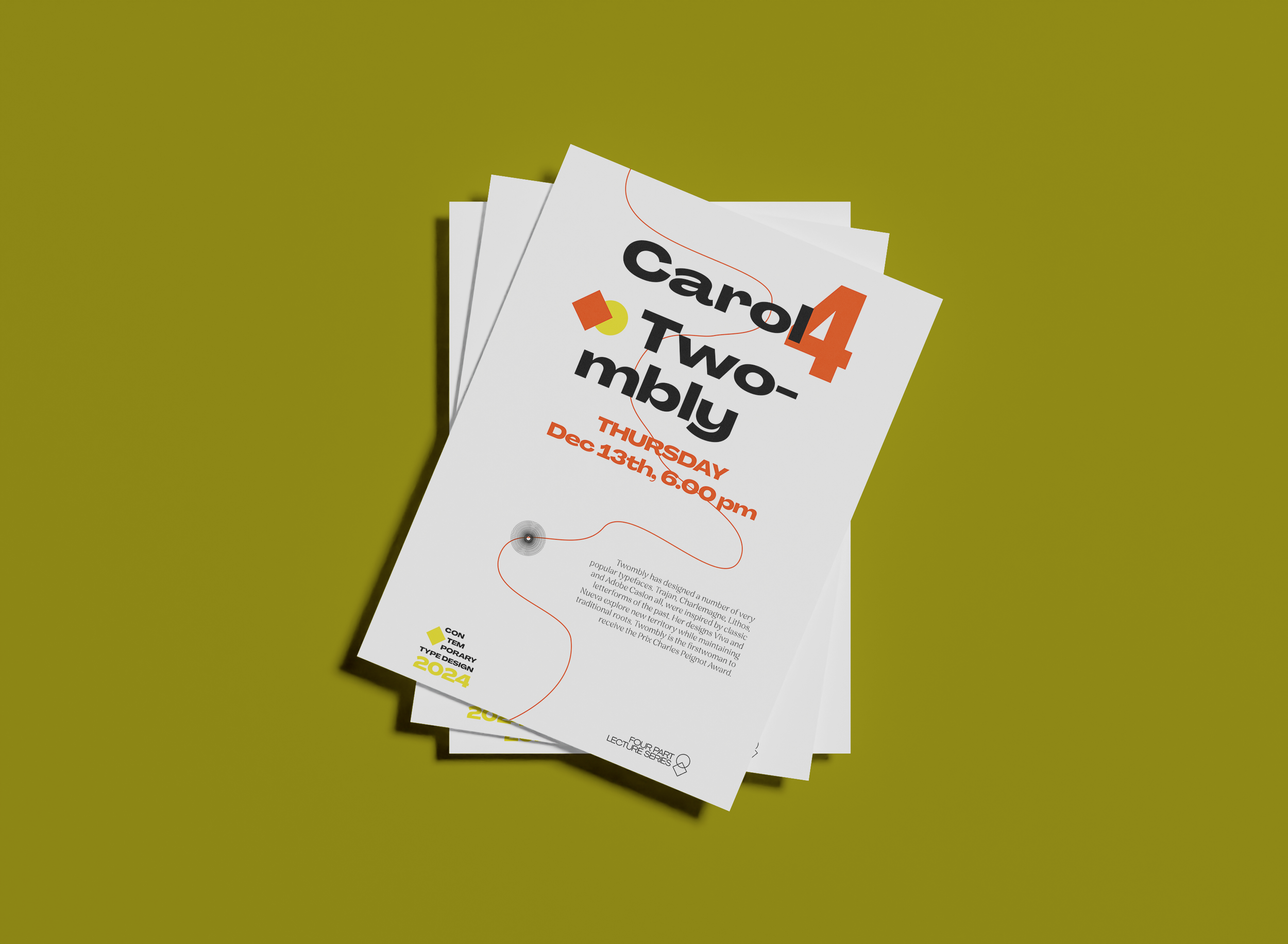
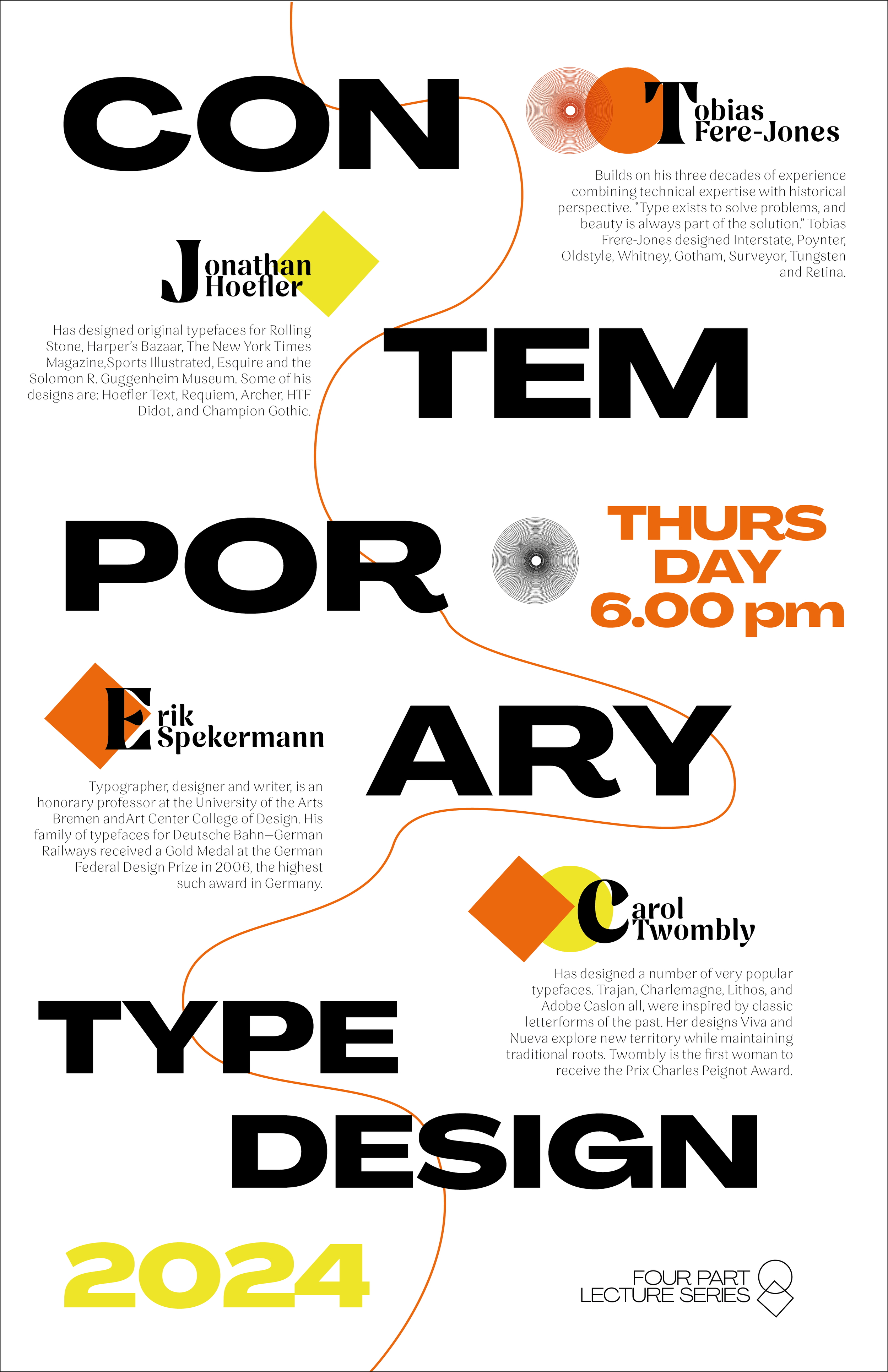
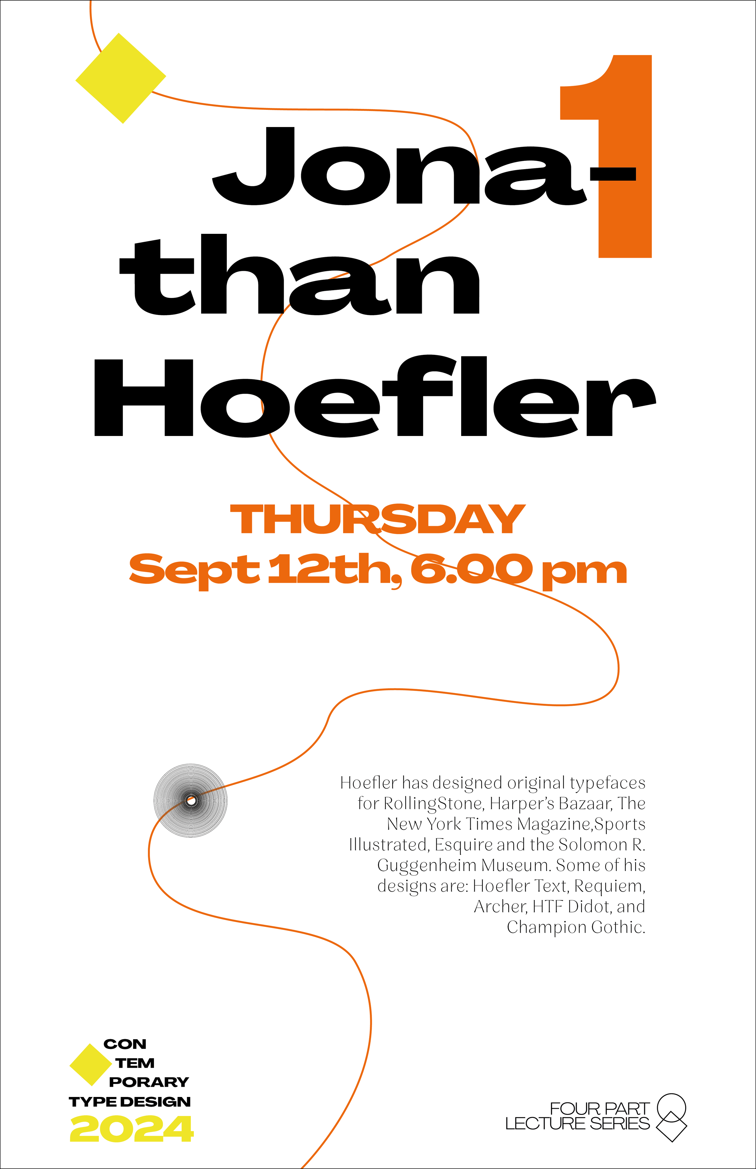
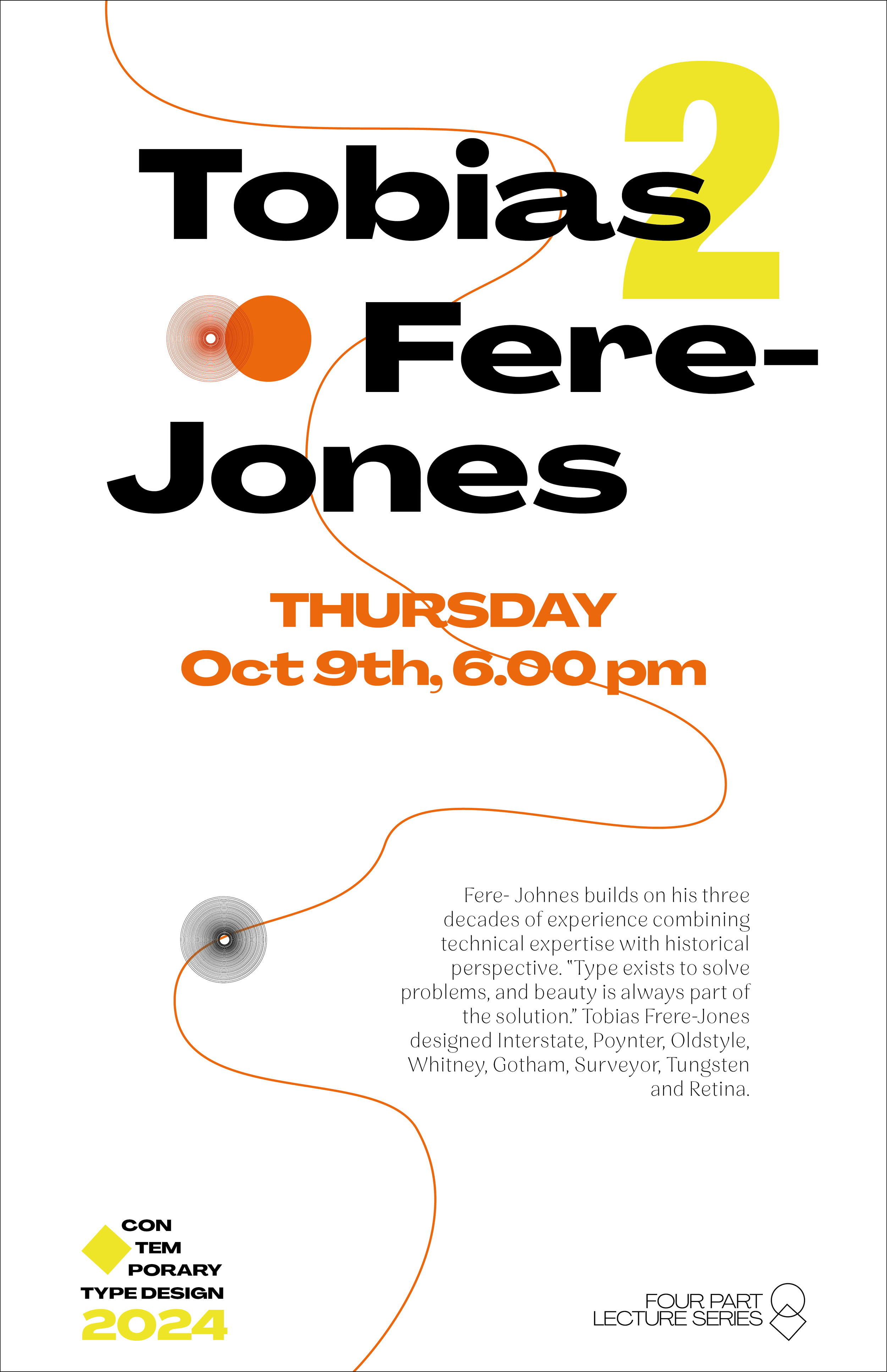
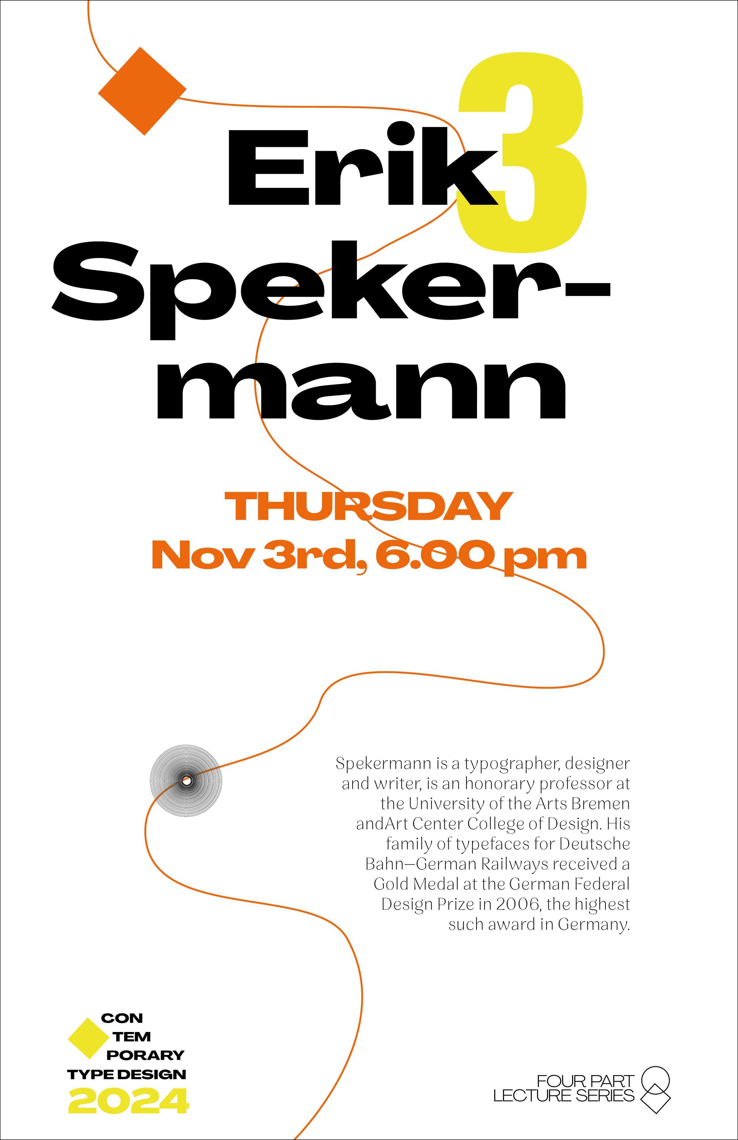
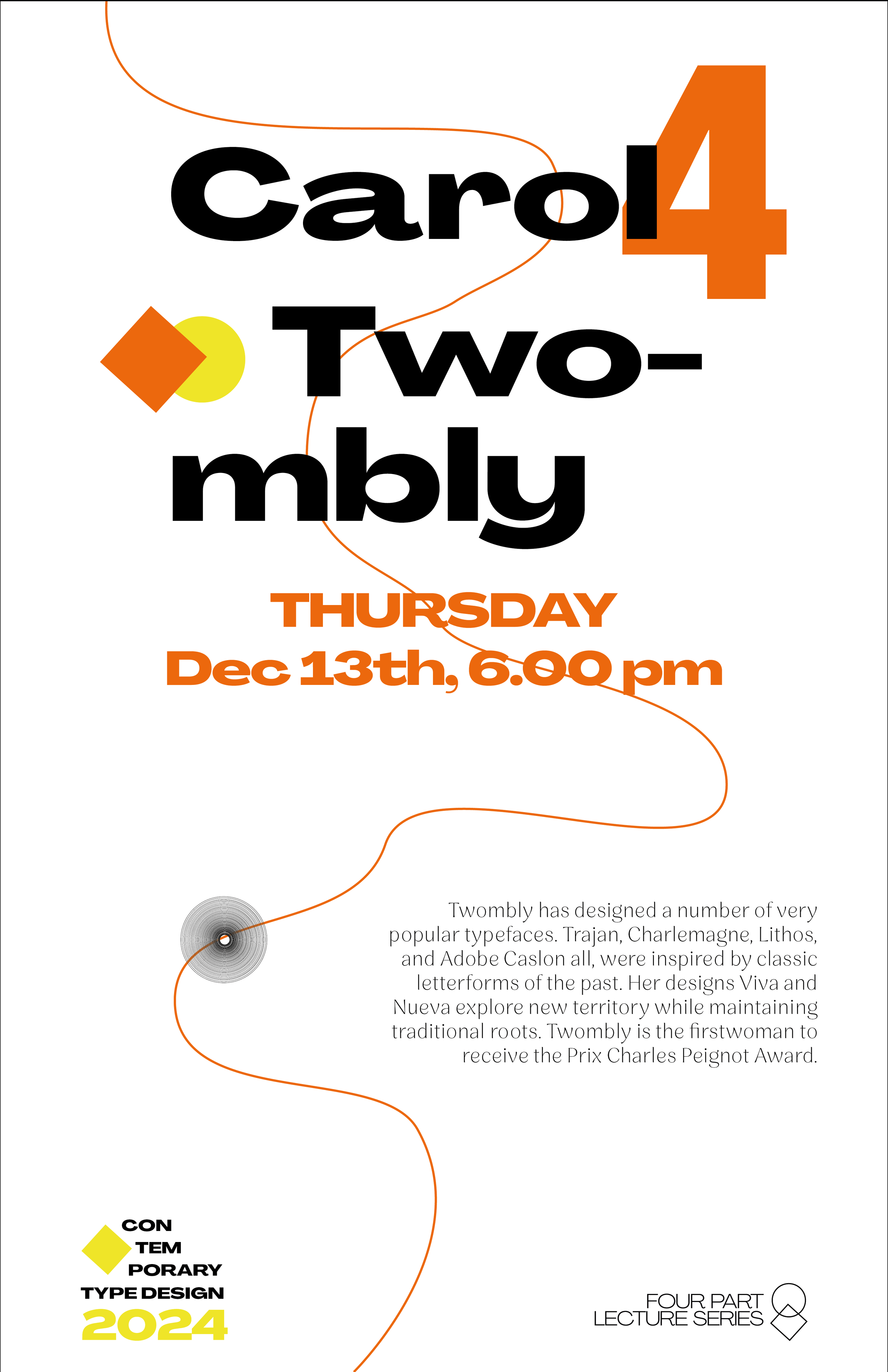
Visual identity and poster system for the 2024 Contemporary Type Design Four-Part Lecture Series, featuring one master poster and four individual speaker posters. Rooted in Bauhaus principles, the design balances geometric structure with bold typographic hierarchy and dynamic asymmetrical composition. A continuous graphic line unifies the series, while large-scale type, bold numeric markers, and a restrained palette of black, orange, and acid yellow create rhythm and contrast across all formats. Each poster functions independently while remaining part of a cohesive visual system.
CD Typography - Parsons School of Design
Record Design Project
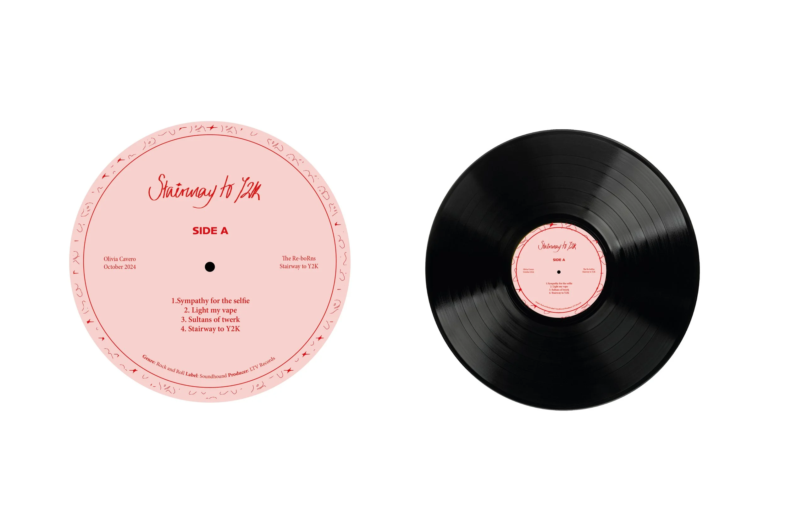
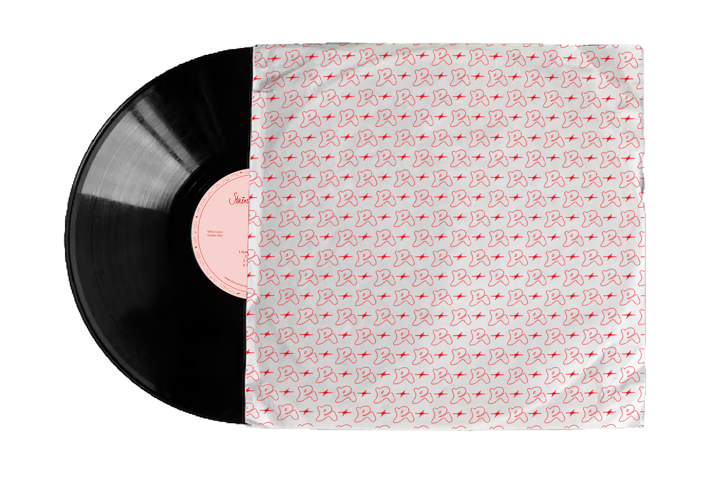
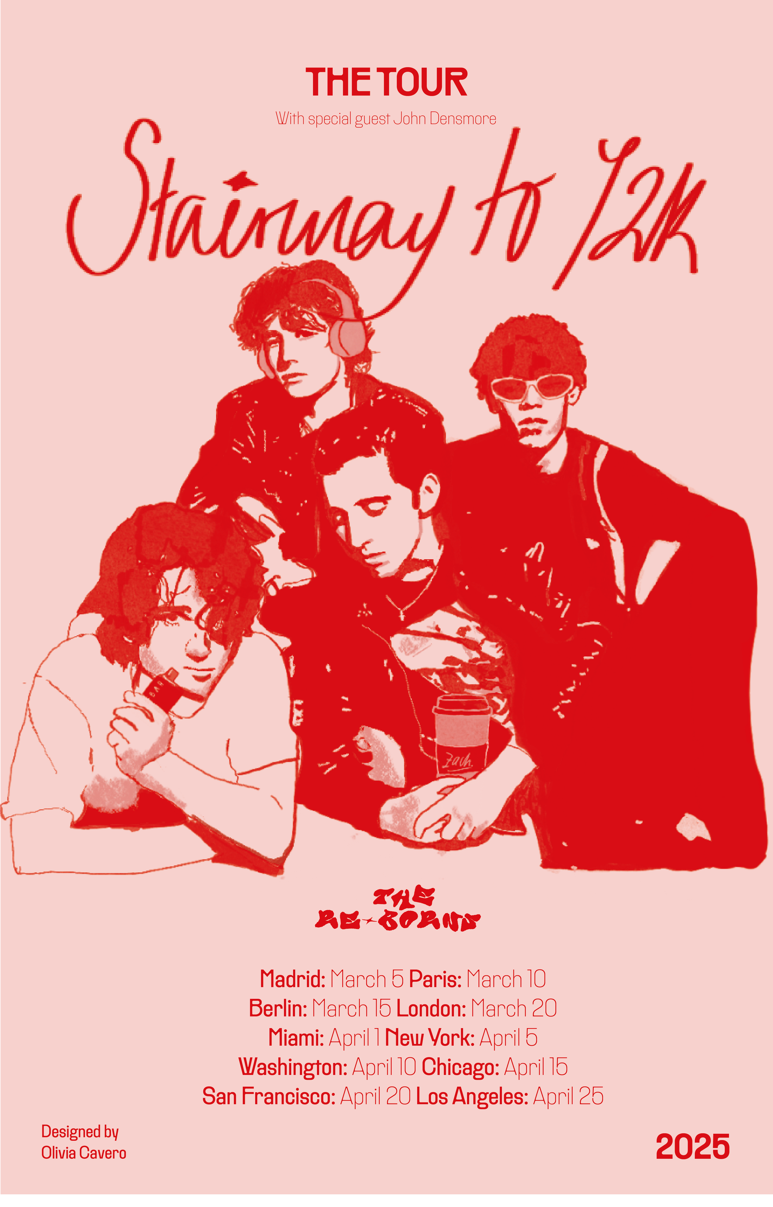
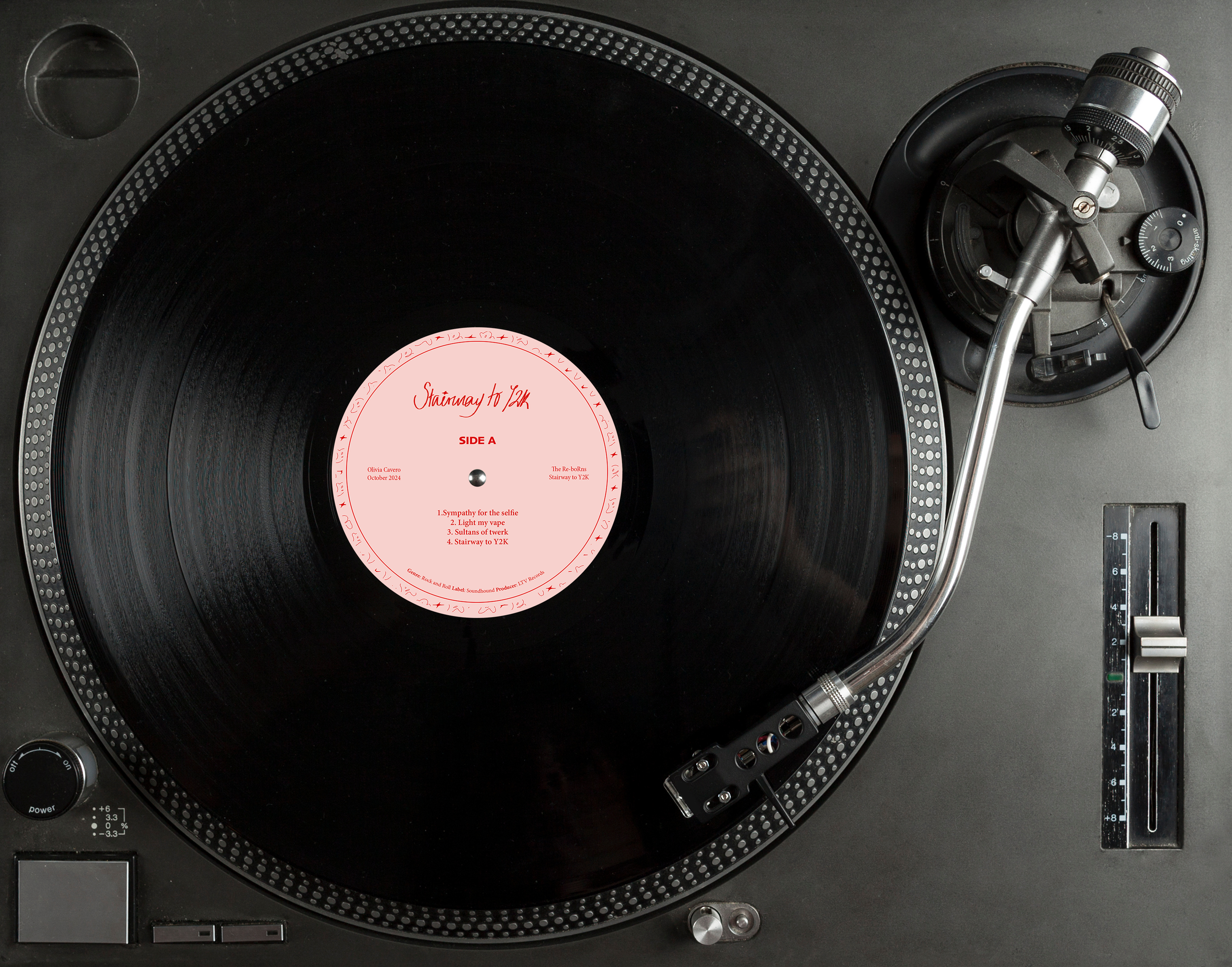
Full visual identity for an original band including a record jacket, sleeve design, vinyl label, and promotional poster.
The Re-Borns is a four-member rock and roll band conceptualized as the revival of classic rock within a modern context. The visual identity merges vintage vinyl aesthetics — bold typography, analog textures, archival color palettes — with contemporary graphic elements and cultural references. Musically, the band blends traditional rock instrumentation with subtle electronic modifications, bridging generational gaps and reintroducing rock and roll to Gen Z and millennial audiences.
CD Typography - Parsons School of Design

Book Cover Design
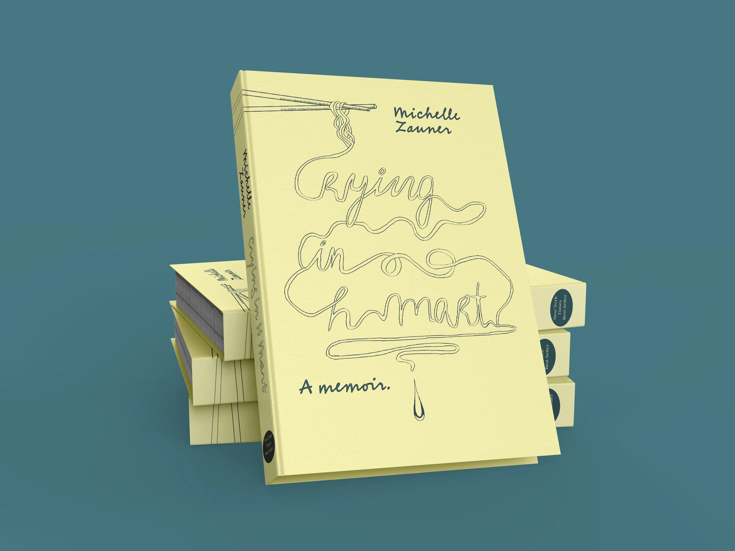
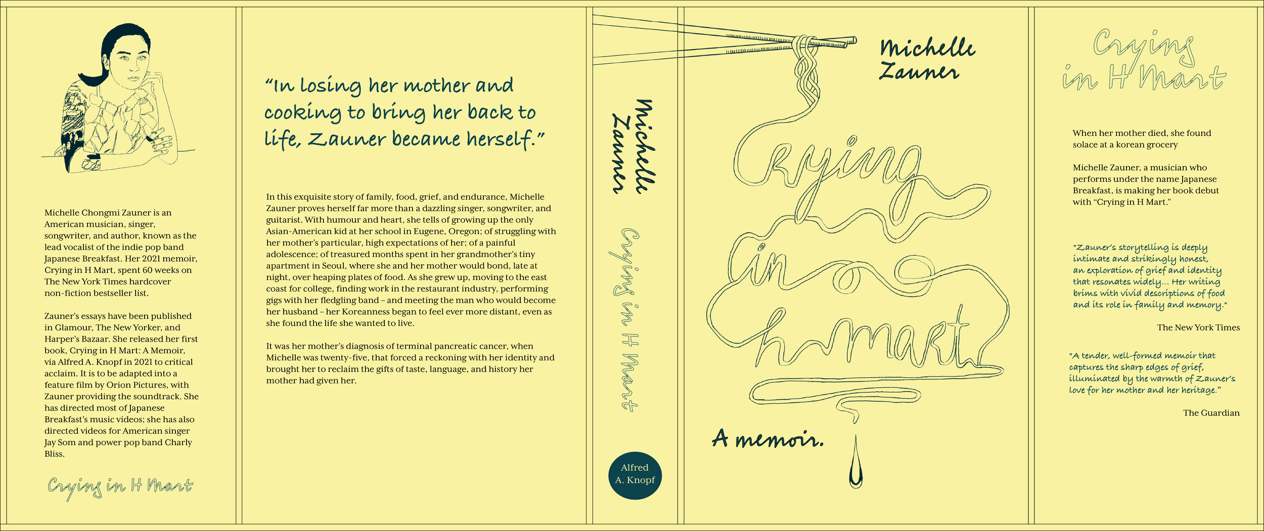
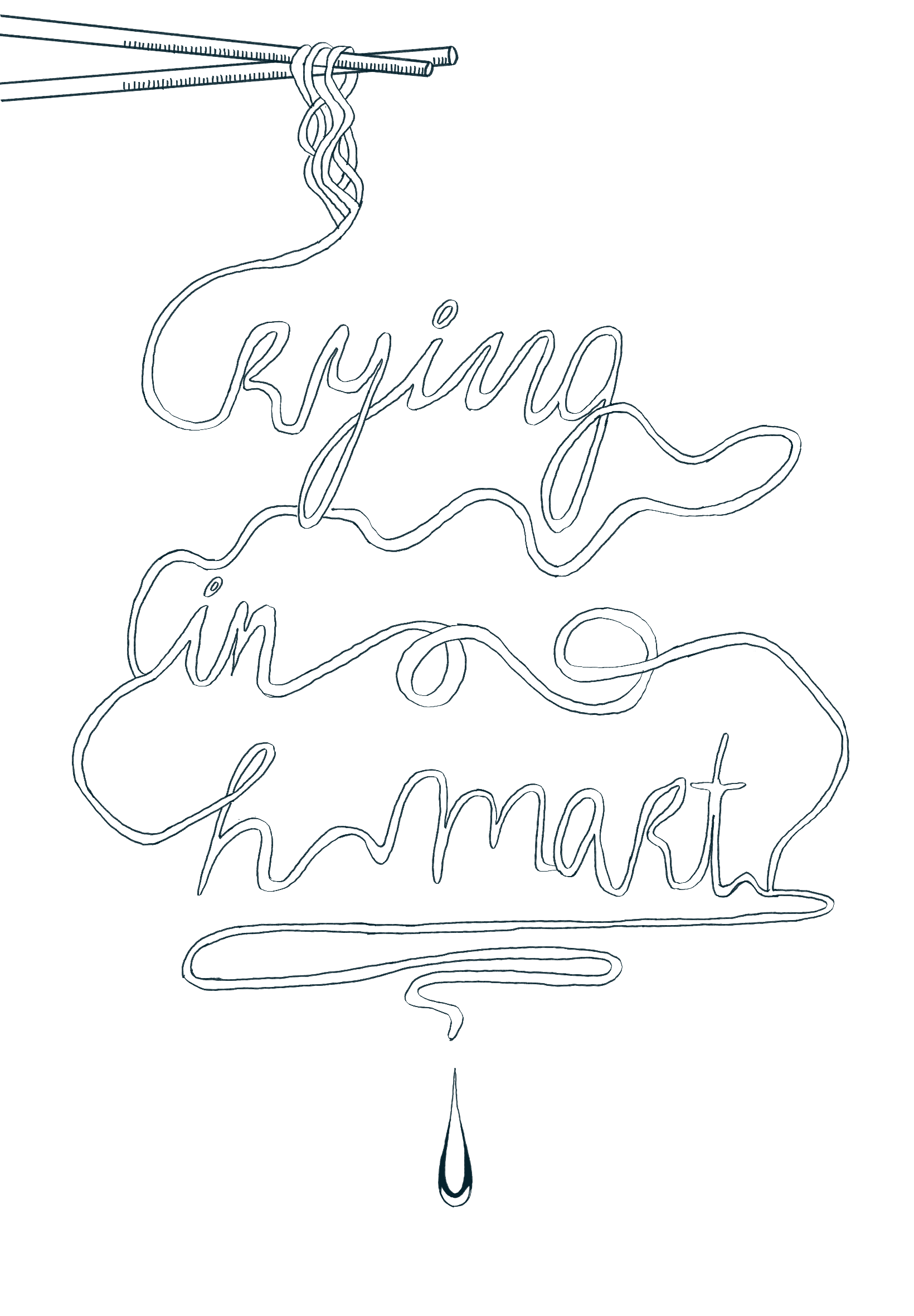
Book jacket design for Crying in H Mart, including cover design, typography selection, color palette, layout, and overall visual identity. The design reflects the book’s exploration of grief, mother–daughter relationships, and cultural identity through a restrained yet emotionally resonant visual language. Inspired by the role of Korean food as a bridge between memory and mourning, the cover integrates symbolic color choices and tactile typography to evoke intimacy, nostalgia, and vulnerability.
CD Typography - Parsons School of Design
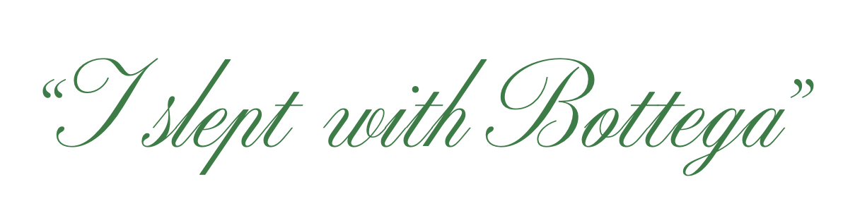
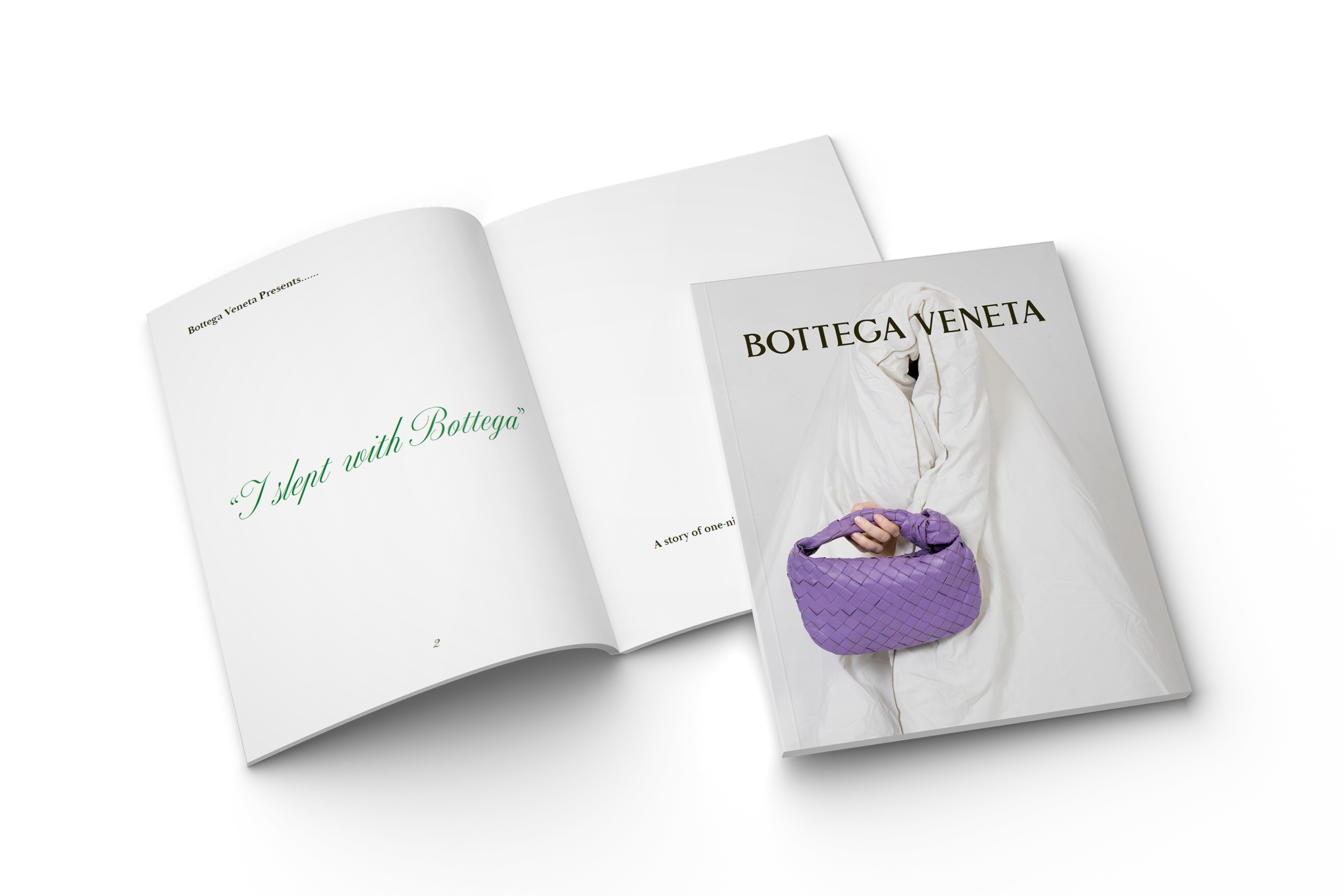
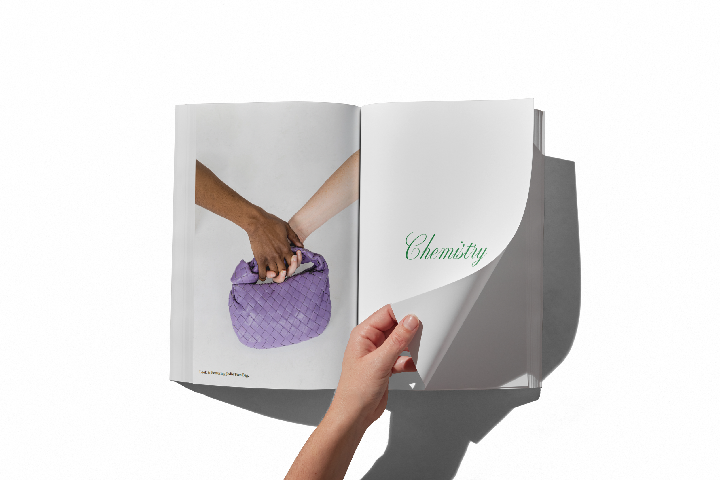
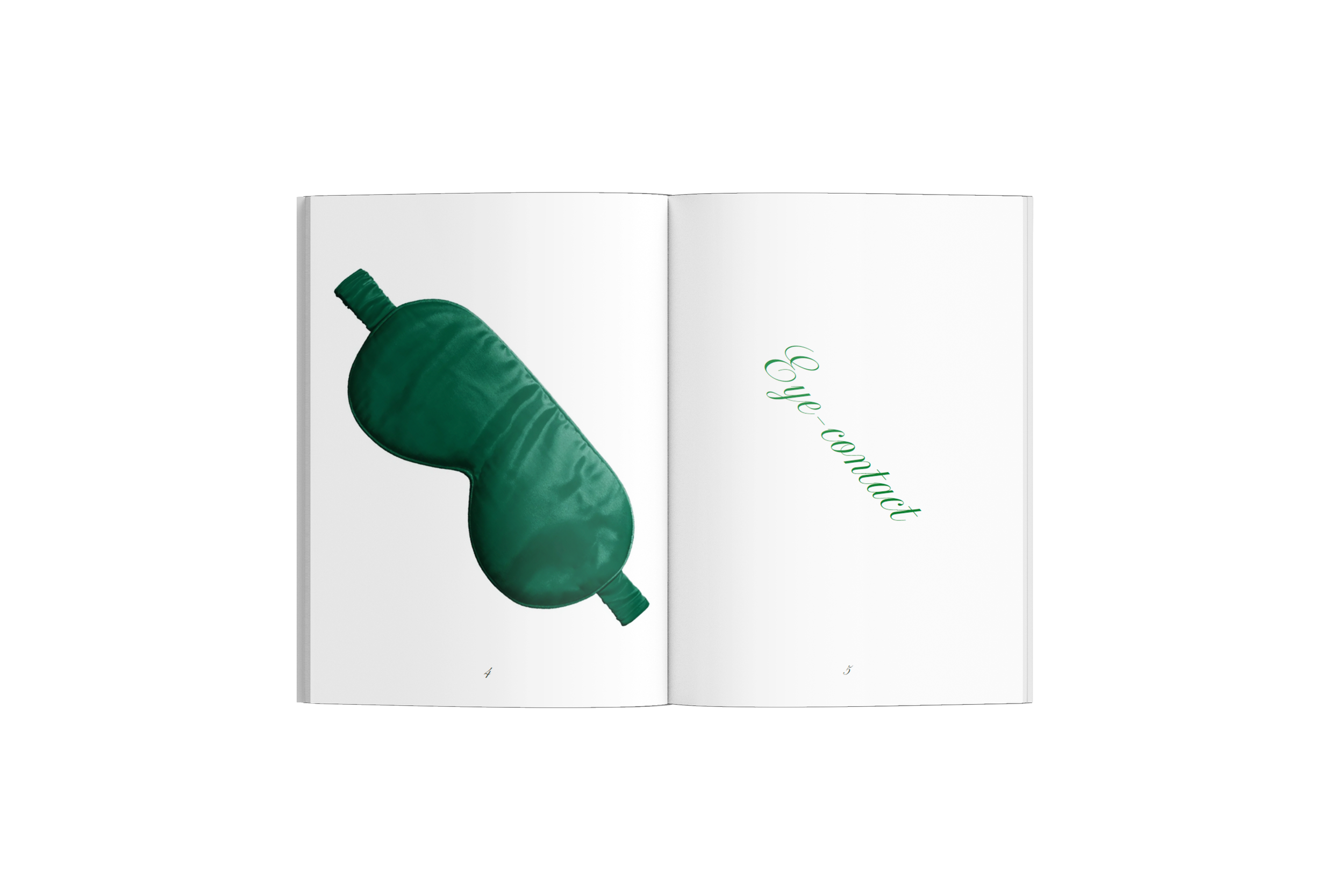
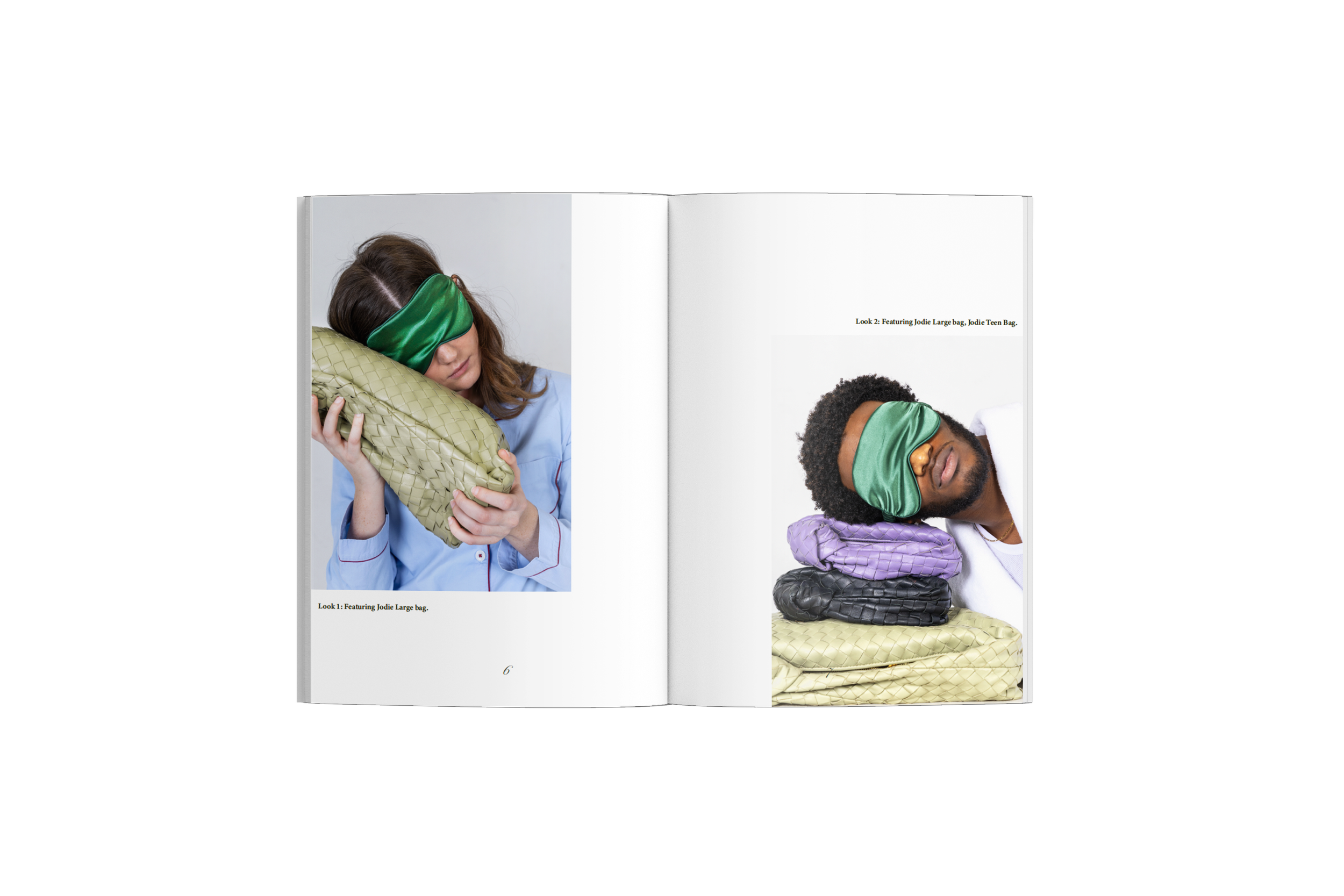
“I Slept with Bottega” explores the narrative tension between excitement and awkwardness in the aftermath of a one-night stand. The campaign integrates everyday domestic objects and morning-after scenarios to create a cinematic yet intimate atmosphere. The concept juxtaposes sensuality with realism, reflecting vulnerability, spontaneity, and modern relationships through subtle storytelling rather than overt imagery.
Visual Communication Lab - Parsons School of Design
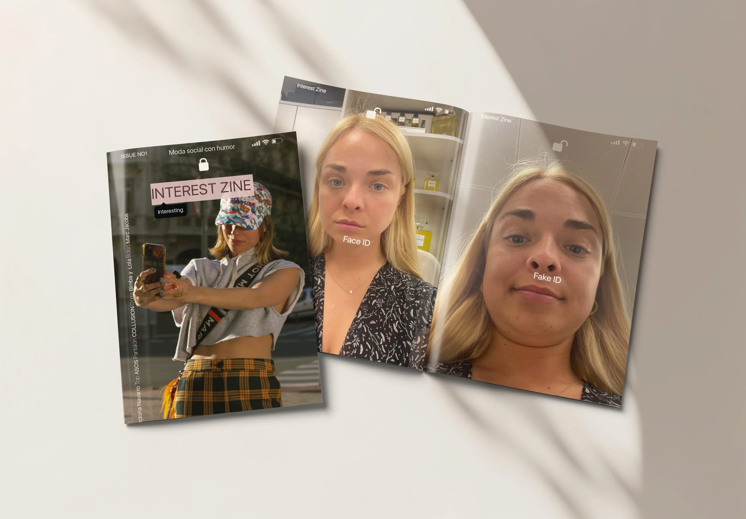
Interest Zine
Interest Zine is a satirical editorial publication addressing social media addiction and its psychological impact on contemporary society. The magazine explores the artificiality of social media and its harmful influence on society, using a satirical lens to constantly contrast the digital world with reality. It highlights the gap between curated online personas and lived, imperfect human experience.
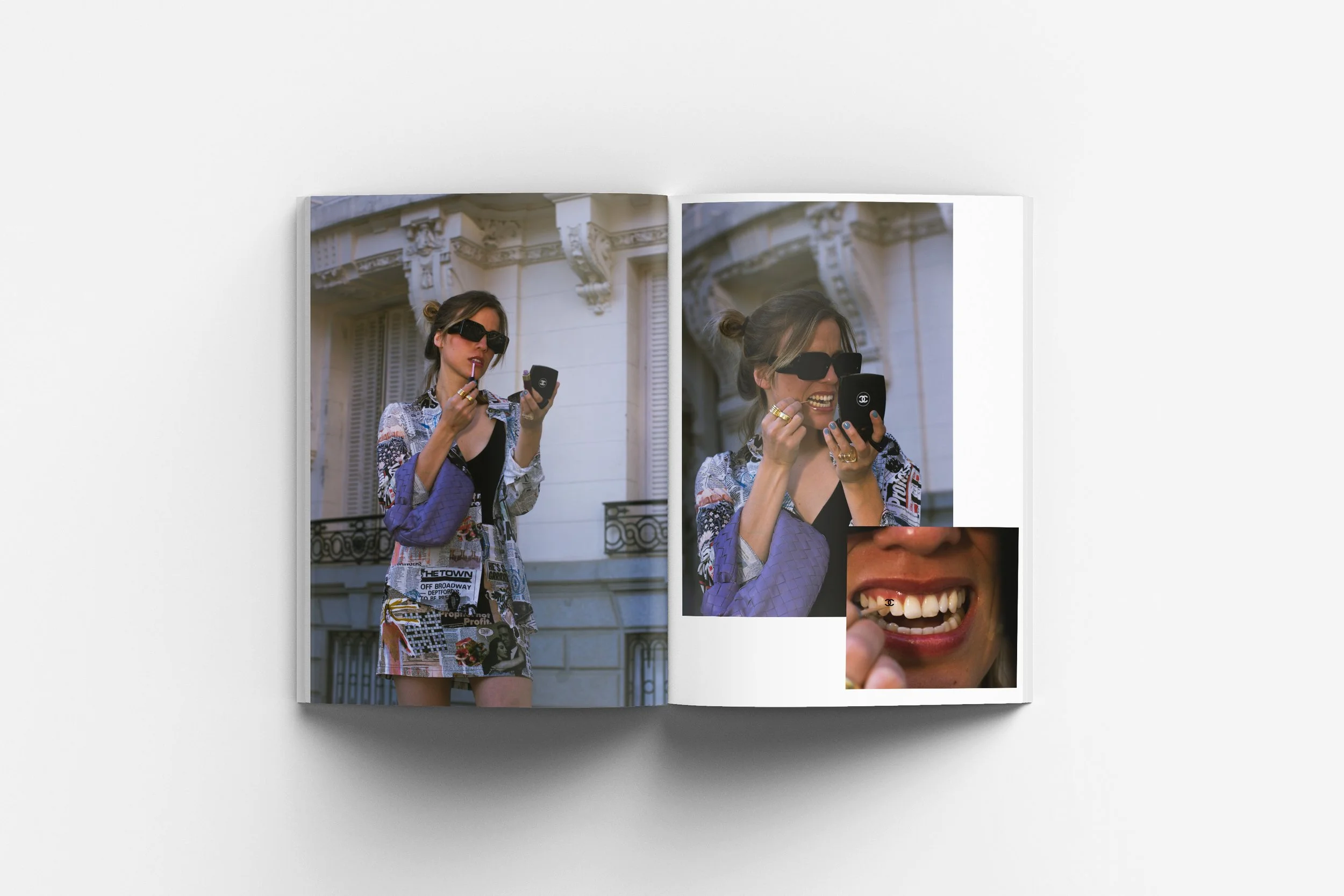
Through five distinct photoshoots, interviews, articles, advertisements, and interactive elements, the project exposes unrealistic beauty standards and lifestyle expectations perpetuated by social media. The tone balances irony and critique while encouraging reflection and self-awareness.
The graphic design and overall aesthetic were inspired by the interface of an iPhone, reinforcing the theme of technology’s pervasive influence in our daily lives. The magazine functions in two orientations: one direction represents “reality,” while the opposite direction represents “social media.” The pages intentionally juxtapose different actings. This shift in acting becomes symbolic — one side presents the constructed, filtered, and performative digital world, while the other reveals the unfiltered, imperfect reality behind it.
Capstone project - IED University